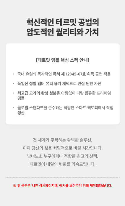
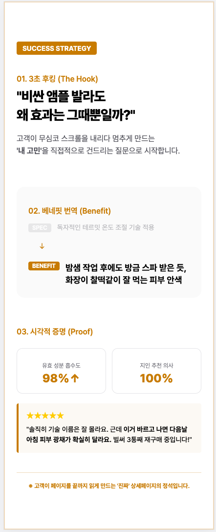
Successful vs. Unsuccessful Shopping Mall Detail Pages
Related Posts
[Update & Pricing Plan Renewal Pre-Announcement] Now Even Animated Detail Pages?! April 30 New Features & Pricing Plan Renewal Notice
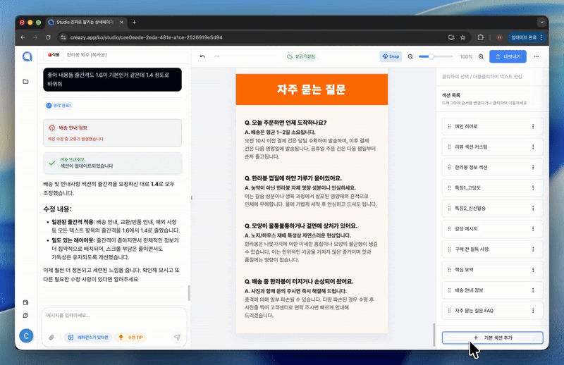
Hello, this is the Creazy team, your reliable partner for CEOs! 🎉 To help our CEOs create high-quality detail pages even faster, we are unveiling a massive renewal of the editor screen along with unprecedented new features on April 30th. Check out what has changed right now! ⭐️ The Editor Screen Has Been Completely Renewed! The chat bar is now on the right!: A dedicated chat bar that lets you communicate with AI in real time and request modifications has been placed on the right side. Integrated left panel: All editing functions, including image generation/replacement and text modification/addition, have been consolidated into one panel on the left. Per-element chat addition feature: Previously, you could already add a section to the chat for modification through "Edit in Chat" in the section toolbar. Now, to enable more precise modifications, we have prepared a feature that lets you designate elements such as text or images and add them to the AI chat. Image background removal feature: No more worries about cutout images — clean background removal is possible with just a single click. Now you can minimize your mouse movement and complete high-quality detail pages even faster! !creazy-new-editor-ui.jpg ⭐️ Finally Here! Create Product Videos with a Single Click Videos, the key to increasing dwell time on detail pages, can now be created with just a single click. Create with reference images: Just insert an image of your product, and AI will naturally create the video you want. The created video can later be exported in GIF or WebP format. Create with text: Don't have a suitable image? No problem. Just enter text like "a scene of harvesting ripe grapes," and AI will instantly generate a GIF for you. !creazy-video-generation-1.png ⭐️ "You're saying animations like a text typing effect are possible?" Yes, a single click is all it takes. If you have a phrase or image you want to emphasize, add lively, dynamic effects to them now. A typing effect where letters are written one by one, eye-catching image/text blinking effects, and a number counter effect that emphasizes sales volume have been added. Of course, it's also possible via AI chat! Just type "Give this a typing effect" into the right-side chat, and AI will understand perfectly and apply it right away. ||| |------|---| |!creazy-new-credit-plan-info-1.png|!creazy-new-credit-plan-info-1.png| [Coming Soon] Introduction of an Even More Advanced Latest Image Generation Model A latest image generation model that is even more advanced than the existing image model is set to be introduced. You will be able to meet OpenAI's GPT-Image-2 model, which has been recognized as the strongest image model currently available across numerous benchmarks. You will be able to experience the latest image model — improved in many areas, including better product consistency and better Korean text rendering — directly in Creazy. [Coming Soon] In May, We Will End Your Worries About Thumbnails and Product Photos! "Why is my product violating Coupang's policy?", "Is there a reason it's pushed down in Naver search results?" Creazy will solve these worries for our CEOs. Perfect learning of platform-specific policies: AI has fully learned the strict thumbnail policies of Coupang and Naver for each category. Complete a thumbnail with the press of a button: From high-quality thumbnails with no worries about policy violations to review photos and product mockup photo generation features, this will all open in mid-May. Please look forward to it! 📢 Pricing Plan Renewal and Credit Policy Notice To provide a more stable and advanced AI environment, the pricing policy will be changed as follows starting April 30th. Image generation credit deduction: The 'image generation' feature, which had been provided free of charge for a limited time, will be changed to a deduction of 5 credits per image in order to improve service quality. Due to the rising costs of AI usage, Change to the additional credit purchase policy: Previously, one-time credit purchases that were stored permanently were possible even without a subscription, but now additional credit purchases will be available only to 'subscription members'. Reduction of additional credit unit price: Instead, in order to clearly ease the burden on subscribing CEOs, the price of one-time additional credit purchases will be reduced by nearly 50%, from the existing 15,000 KRW to 8,000 KRW. Users who still found their credits insufficient even after subscribing can now purchase additional credits more affordably. !creazy-new-credit-plan-info-1.png !creazy-new-credit-plan-info-2.png This update has been prepared so that Creazy can become the most powerful tool for boosting our CEOs' sales. The Creazy team will always listen carefully to our CEOs' voices and move as quickly as possible. If you have any inconveniences or feature suggestions, please let us know anytime! ⬇️ Click the photo to be connected to the Creazy service. ⬇️ Click the photo and try Creazy right now! Go to Creazy
The Standard for Detail Page Color Combinations (with Creazy)
Detail Page Creation: Why Does a Single Color Change Sales? The detail page is the most powerful touchpoint where you meet customers in an online mall. Many small business owners put effort into flashy graphics or lengthy explanations, but often overlook the power of color that dominates customers' unconscious minds and stimulates their emotions. Color is not just a tool to make a page look pretty; it is a psychological device that determines the first impression of a brand and instantly stimulates the desire to purchase. Why Color Equals Conversion Rate Online customers grasp the mood of a brand within just 3 seconds of accessing a detail page. At this moment, the first piece of information the customer's brain recognizes is 'color'. This is because color accounts for over 80% of visual information. A stable and attractive color combination keeps the customer's eyes on the page and instills positive expectations about the product. When colors suitable for the product's characteristics are properly arranged, customers feel that the brand is sensible and professional. Just like using warm colors that stimulate the appetite when selling warm food, and using calm, cool colors when selling IT devices where trust is crucial. A well-planned color translates into a psychological conviction: "This product suits my taste and can be trusted." !SCR-20260312-pshm.png Tip: Avoid the overuse of neon or primary colors so customers don't feel fatigued. A detail page that is easy on the eyes increases the probability of them clicking the buy button. Common Detail Page Design Mistakes by Small Business Owners Using Too Many Colors & Distracting the Eyes: The most common mistake is overusing various colors in an attempt to make things stand out. When more than four popping colors are mixed on one page, customers lose their way on where to focus and bounce off. Ignoring Brightness and Saturation Contrast: If the contrast between the background color and the text color is not clear, readability drops sharply. Writing white text on a light gray background or writing in dark colors on a dark background makes delivering information impossible. Mismatched Tone and Manner with the Product: Using blue as the main color for diets or health functional foods, which suppresses the appetite, or using a light, vivid yellow for a premium product—when the essence of the product and the color clash, credibility drops. !SCR-20260312-przl.png Solution: If you want to create a sophisticated detail page, the key is to set a consistent color palette that follows the golden ratio and design only within it. The Magic Ratio Learned from Studio Ghibli, the '6:3:1 Rule' 'Studio Ghibli', the animation masterpiece studio that captivated the world with its beautiful and comfortable colors. Behind their uniquely harmonious visual beauty hides the '6:3:1 Color Rule', which is called the standard in the interior and design industries. By applying this ratio to detail pages, even beginners can create screens with a professional level of stability. Background Color - 60%: The color that takes up the wide background of the detail page. It's best to use achromatic colors or pastel tones that are easy on the eyes, such as white, ivory, or light gray, so the product and text can stand out. Main Color - 30%: The color representing the brand's identity. It is used for title bars, subtitle backgrounds, information boxes, etc., and drives the overall mood of the detail page. It is good to utilize the product package color or brand logo color. Point Color - 10%: A highlighting color used where you need to catch the customer's eye instantly. It is used for the 'Buy Button', 'Discount Rate (%)', and core copy you want to emphasize, choosing a complementary or intense color that contrasts with the main color to induce clicks. !GeminiGeneratedImage_81tdzj81tdzj81td (1).png 4 Best Industry-Specific Color Combinations for Detail Pages Depending on the product category, the emotion customers expect is different. We propose industry-specific color combinations that increase the success rate. ① Food/Dining (Red & Orange) Characteristics: Warm colors that stimulate the appetite and give a cozy feeling. Application: Optimal for products that need to stimulate the palate, like tteokbokki, meat, and bakery items. Using dark red or orange as a point color increases the click-through rate. !SCR-20260312-psym.png ② IT/Electronics/Services (Navy & Blue) Characteristics: Cool colors that give a sense of professionalism, trust, and rationality. Application: Suitable for smartphone accessories, home appliances, or informational service products. Combining a white background (60%) with a navy main (30%) and a sky blue point (10%) looks clean. !SCR-20260312-ptgs.png ③ Beauty/Fashion/Living (Beige & Muted Tone) Characteristics: Neutral colors that give an emotional, soft, and luxurious feeling. Application: Great for cosmetics, clothing, and interior props. Set low-saturation beige or pink as the main color, and match the tone by using a calm brown or charcoal that doesn't stand out too much as the point color. !SCR-20260312-pugk.png ④ Eco-friendly/Health Foods (Green & Brown) Characteristics: Colors symbolizing nature, organic, health, and comfort. Application: Essential for salad, vegan cosmetics, and supplement detail pages. Use green, the color of nature, as the main color, and brown or deep green, the color of earth, as a point color to give trust. !SCR-20260312-ptvf.png Frequently Asked Questions (FAQ) Q1. Is it best to use pure black (#000000) for body text color? This is the most common misconception. The contrast between pure black (#000000) and a white background is too strong, making the eyes tired when reading long texts. It is much better for readability to use a slightly softer dark gray (e.g., #333333, #444444) for body text. Q2. Can I mix two or more main colors? If you are a beginner, it is recommended to unify with 1 main color. If you want to mix multiple colors, rather than adding completely different colors, maintain consistency by using a 'Tone on Tone' method where you only slightly adjust the brightness and saturation of the main color. Q3. What if it's hard to find a color combination that suits our product? Try utilizing color curation sites like 'Adobe Color' or 'Coolors'. They automatically recommend trendy color palettes, so you can find excellent combinations even without a sense of color arrangement. The Creazy team sincerely hopes that through these design tips, your business operations will be successful. However, if you find these contents difficult and wish everything could be done at once, we invite you to try our service, Creazy. It has already learned and internalized all the contents written above, and you can create a quality detail page ready to use within 3 minutes. Besides that, modifications are also incredibly simple; try Creazy right now, where you can edit just by speaking! !Service Demo.gif ⬇️ Click the photo to start using Creazy right away! Go to Creazy
How to Discover Selling Points (Hooks) That Truly Resonate with Users
Landing Page Planning: Why are sales stagnant even with a great product? A landing page is the most powerful persuasion tool to get customers to open their wallets in an online mall. Many small business owners spend a lot of money on high-performance camera photos or sophisticated designs, but often end up watching customers leave because they fail to capture the selling points that pierce the customer's heart. A selling point is not just a list of product features; it is a psychological trigger that touches the customer's deficiency and creates a reason to buy. Why Discovering Selling Points Equals Conversion Rate Online customers do not 'read' landing pages; they scan them. No matter how much text there is, the moment they judge it's not information they need, they close the tab. What catches the customer's eye at this moment is not flowery rhetoric, but an intuitive conviction that "This is the item that will solve my problem." When selling points that fit the customer's needs perfectly are placed, the customer feels a sense of urgency—'it has to be this product'—beyond mere trust in the brand. In fact, cases where sales conversion rates significantly increased compared to ad clicks just by redefining selling points from product specs to customer benefits prove this. !SCR-20260224-jstv.png Tip: When finding selling points, focus on the 'Benefit' the customer will receive, not the 'Feature' of the product. A customer buying a drill doesn't want a drill; they want a 'hole in the wall.' Common Mistakes Small Businesses Make in Selecting Selling Points Listing Features from a Supplier Mindset: Examples include "Using top-quality materials" or "Patented method." This is just bragging from the manufacturer's perspective. Customers want a kind explanation of why that is good for them*. Overuse of Abstract Words: Vague expressions like "Overwhelming quality" or "Innovative design" actually lower credibility and don't stick in the customer's memory as anyone can use them. Targeting Failure: If you try to sell to everyone, you sell to no one. Messages written without a clear target persona fail to penetrate the core customer's heart and just float around. !SCR-20260305-oxrk.png Solution: You need a reverse approach: observe the language customers actually use and extract selling points from the specific discomforts (Pain Points) they experience. 5 Ways to Discover Selling Points That Work on Users We propose 5 discovery strategies most preferred by current marketers for successful landing page planning. Competitor Review Mining: Analyze the '2-3 star' reviews of competitor products. The '2% insufficiency' that customers feel becomes your product's powerful selling point. !SCR-20260305-oypa.png The 'So What?' Questioning Method: Ask "So what?" three times after a product feature. "Lightweight laptop" → "Easy to carry" → "Workable anywhere" → "Protects work-life balance." This is how the final benefit is derived. !SCR-20260305-oyqj.png Utilize Deficiency and Fear (FOMO): Visualize the loss or inconvenience the customer will experience if they don't use the product. A message saying it prevents misfortune is sometimes a stronger motivation than promising happiness. !SCR-20260305-oysf.png CS Data Analysis: The questions customers ask most before purchasing are the hurdles preventing them from buying. Place answers to those questions as selling points at the top of the landing page to resolve anxiety. !SCR-20260305-ozdk.png Imagine the Target Persona's Day: Create specific situations (Context) where the customer needs this product from the moment they wake up until they go to sleep. !SCR-20260305-oywz.png Placement Strategies to Increase Performance 🚀 Harmony of Hooking and Proof Hooking: A phrase at the top of the landing page that draws customer empathy. Start with a question or a strong benefit, like "Are you still worried about swelling every morning?" Proof: Evidence supporting the selling point. Help customers make rational judgments through experimental data, overwhelming numbers of reviews, or official certifications. !SCR-20260305-pant.png Tip: Don't put too many selling points on one page. One main selling point and 2-3 supporting sub-points are the most memorable. Guide to Successful Selling Point Combinations ① Problem Posing & Immediate Solution Feature: Vividly describe the pain the customer experiences, then show how our product ends that pain. Application: "Were you worried about your neighbors because of floor noise?" (Problem) → "Special 8-layer structure mat completely blocks footsteps" (Solution) ② Turning Features into Benefits & Visual Evidence Feature: Go beyond simple specs to show how the customer's life changes, and prove it with before/after photos. Application: "Suction power 30,000Pa" (Feature) → "Cleans even invisible fine dust at once" (Benefit) → "Microscope photo" (Evidence) ③ Stressing Cost-effectiveness Based on Trust Feature: Emphasize that it is a rational purchase by explaining why you could lower the price while maintaining high quality (D2C, process improvement, etc.), not just because it's cheap. Frequently Asked Questions (FAQ) Q1. Our product is ordinary, so what if there are no special selling points? If the product itself is ordinary, find selling points in the 'Service' or 'Brand Story.' "The sincerity of the owner directly inspecting and writing a hand-written letter" or "Guaranteed same-day shipping for orders before 4 PM" are also excellent selling points. Q2. What if the click-through rate is low even after setting the selling points? Check if the selling point of the main thumbnail and the top copy match. Also, to find the selling point with the best response, it is good to conduct A/B testing and slightly modify the copy. Q3. How can I set the target persona most accurately? Rather than creating a fictional character, think of one actual regular customer who would love our product the most. Digging deep into why that person bought our product and what worries they had is the most reliable method. The Creazy team sincerely hopes that your landing pages become capable, 24/7 sales representatives through these planning strategies. However, if the process of discovering selling points and writing copy feels overwhelming, please try our service, Creazy. Our AI, which has already learned from tens of thousands of success data points, will suggest the perfect 'winning selling point' for your product and complete a professional-level landing page in just 3 minutes. In fact, the landing page designs used in this blog post were all created through Creazy AI. !service-demo.gif ⬇️ Click the image to start using Creazy now! Go to Creazy