The Standard for Detail Page Color Combinations (with Creazy)
Detail Page Creation: Why Does a Single Color Change Sales?
The detail page is the most powerful touchpoint where you meet customers in an online mall. Many small business owners put effort into flashy graphics or lengthy explanations, but often overlook the power of color that dominates customers' unconscious minds and stimulates their emotions.
Color is not just a tool to make a page look pretty; it is a psychological device that determines the first impression of a brand and instantly stimulates the desire to purchase.
1. Why Color Equals Conversion Rate
Online customers grasp the mood of a brand within just 3 seconds of accessing a detail page. At this moment, the first piece of information the customer's brain recognizes is 'color'. This is because color accounts for over 80% of visual information. A stable and attractive color combination keeps the customer's eyes on the page and instills positive expectations about the product.
When colors suitable for the product's characteristics are properly arranged, customers feel that the brand is sensible and professional. Just like using warm colors that stimulate the appetite when selling warm food, and using calm, cool colors when selling IT devices where trust is crucial. A well-planned color translates into a psychological conviction: "This product suits my taste and can be trusted."
Tip: Avoid the overuse of neon or primary colors so customers don't feel fatigued. A detail page that is easy on the eyes increases the probability of them clicking the buy button.
2. Common Detail Page Design Mistakes by Small Business Owners
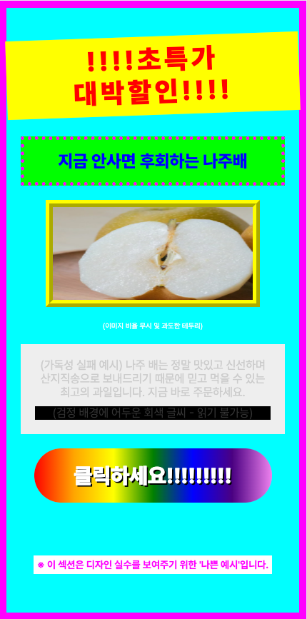
- Using Too Many Colors & Distracting the Eyes: The most common mistake is overusing various colors in an attempt to make things stand out. When more than four popping colors are mixed on one page, customers lose their way on where to focus and bounce off.
- Ignoring Brightness and Saturation Contrast: If the contrast between the background color and the text color is not clear, readability drops sharply. Writing white text on a light gray background or writing in dark colors on a dark background makes delivering information impossible.
- Mismatched Tone and Manner with the Product: Using blue as the main color for diets or health functional foods, which suppresses the appetite, or using a light, vivid yellow for a premium product—when the essence of the product and the color clash, credibility drops.
Solution: If you want to create a sophisticated detail page, the key is to set a consistent color palette that follows the golden ratio and design only within it.
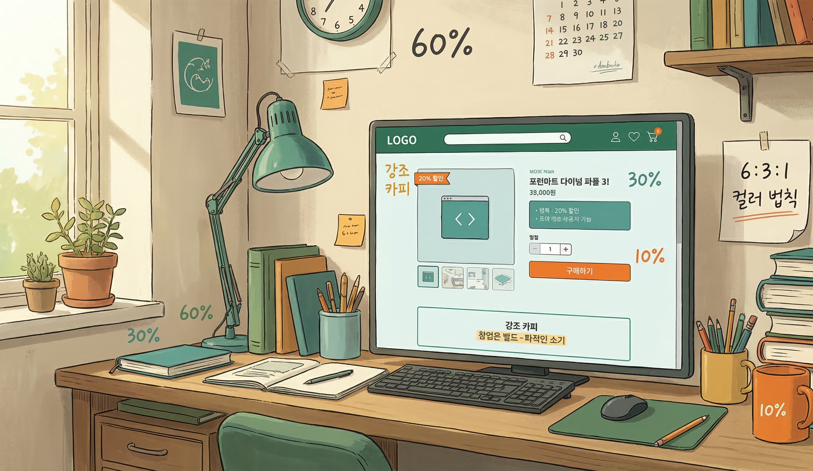
3. The Magic Ratio Learned from Studio Ghibli, the '6:3:1 Rule'
'Studio Ghibli', the animation masterpiece studio that captivated the world with its beautiful and comfortable colors. Behind their uniquely harmonious visual beauty hides the '6:3:1 Color Rule', which is called the standard in the interior and design industries. By applying this ratio to detail pages, even beginners can create screens with a professional level of stability.
- Background Color - 60%: The color that takes up the wide background of the detail page. It's best to use achromatic colors or pastel tones that are easy on the eyes, such as white, ivory, or light gray, so the product and text can stand out.
- Main Color - 30%: The color representing the brand's identity. It is used for title bars, subtitle backgrounds, information boxes, etc., and drives the overall mood of the detail page. It is good to utilize the product package color or brand logo color.
- Point Color - 10%: A highlighting color used where you need to catch the customer's eye instantly. It is used for the 'Buy Button', 'Discount Rate (%)', and core copy you want to emphasize, choosing a complementary or intense color that contrasts with the main color to induce clicks.
4. 4 Best Industry-Specific Color Combinations for Detail Pages
Depending on the product category, the emotion customers expect is different. We propose industry-specific color combinations that increase the success rate.
① Food/Dining (Red & Orange)
- Characteristics: Warm colors that stimulate the appetite and give a cozy feeling.
- Application: Optimal for products that need to stimulate the palate, like tteokbokki, meat, and bakery items. Using dark red or orange as a point color increases the click-through rate.
② IT/Electronics/Services (Navy & Blue)
- Characteristics: Cool colors that give a sense of professionalism, trust, and rationality.
- Application: Suitable for smartphone accessories, home appliances, or informational service products. Combining a white background (60%) with a navy main (30%) and a sky blue point (10%) looks clean.
③ Beauty/Fashion/Living (Beige & Muted Tone)
- Characteristics: Neutral colors that give an emotional, soft, and luxurious feeling.
- Application: Great for cosmetics, clothing, and interior props. Set low-saturation beige or pink as the main color, and match the tone by using a calm brown or charcoal that doesn't stand out too much as the point color.
④ Eco-friendly/Health Foods (Green & Brown)
- Characteristics: Colors symbolizing nature, organic, health, and comfort.
- Application: Essential for salad, vegan cosmetics, and supplement detail pages. Use green, the color of nature, as the main color, and brown or deep green, the color of earth, as a point color to give trust.
5. Frequently Asked Questions (FAQ)
Q1. Is it best to use pure black (#000000) for body text color? This is the most common misconception. The contrast between pure black (#000000) and a white background is too strong, making the eyes tired when reading long texts. It is much better for readability to use a slightly softer dark gray (e.g., #333333, #444444) for body text.
Q2. Can I mix two or more main colors? If you are a beginner, it is recommended to unify with 1 main color. If you want to mix multiple colors, rather than adding completely different colors, maintain consistency by using a 'Tone on Tone' method where you only slightly adjust the brightness and saturation of the main color.
Q3. What if it's hard to find a color combination that suits our product? Try utilizing color curation sites like 'Adobe Color' or 'Coolors'. They automatically recommend trendy color palettes, so you can find excellent combinations even without a sense of color arrangement.
The Creazy team sincerely hopes that through these design tips, your business operations will be successful.
However, if you find these contents difficult and wish everything could be done at once, we invite you to try our service, Creazy. It has already learned and internalized all the contents written above, and you can create a quality detail page ready to use within 3 minutes.
Besides that, modifications are also incredibly simple; try Creazy right now, where you can edit just by speaking!
⬇️ Click the photo to start using Creazy right away!
Related Posts
[Update & Pricing Plan Renewal Pre-Announcement] Now Even Animated Detail Pages?! April 30 New Features & Pricing Plan Renewal Notice
Hello, this is the Creazy team, your reliable partner for CEOs! 🎉 To help our CEOs create high-quality…
Successful vs. Unsuccessful Shopping Mall Detail Pages
The Decisive Difference: Successful vs. Unsuccessful Shopping Mall Detail Pages If you're running an online…
How to Discover Selling Points (Hooks) That Truly Resonate with Users
Landing Page Planning: Why are sales stagnant even with a great product? A landing page is the most powerful…