Why are customers so persuaded by the review section? (with Creazy)


Related Posts
[Update & Pricing Plan Renewal Pre-Announcement] Now Even Animated Detail Pages?! April 30 New Features & Pricing Plan Renewal Notice
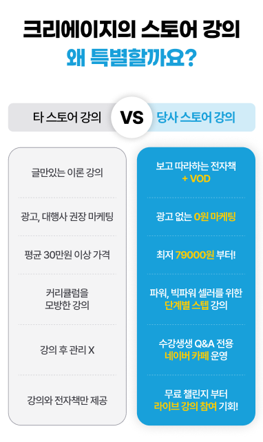
Hello, this is the Creazy team, your reliable partner for CEOs! 🎉 To help our CEOs create high-quality detail pages even faster, we are unveiling a massive renewal of the editor screen along with unprecedented new features on April 30th. Check out what has changed right now! ⭐️ The Editor Screen Has Been Completely Renewed! The chat bar is now on the right!: A dedicated chat bar that lets you communicate with AI in real time and request modifications has been placed on the right side. Integrated left panel: All editing functions, including image generation/replacement and text modification/addition, have been consolidated into one panel on the left. Per-element chat addition feature: Previously, you could already add a section to the chat for modification through "Edit in Chat" in the section toolbar. Now, to enable more precise modifications, we have prepared a feature that lets you designate elements such as text or images and add them to the AI chat. Image background removal feature: No more worries about cutout images — clean background removal is possible with just a single click. Now you can minimize your mouse movement and complete high-quality detail pages even faster! !creazy-new-editor-ui.jpg ⭐️ Finally Here! Create Product Videos with a Single Click Videos, the key to increasing dwell time on detail pages, can now be created with just a single click. Create with reference images: Just insert an image of your product, and AI will naturally create the video you want. The created video can later be exported in GIF or WebP format. Create with text: Don't have a suitable image? No problem. Just enter text like "a scene of harvesting ripe grapes," and AI will instantly generate a GIF for you. !creazy-video-generation-1.png ⭐️ "You're saying animations like a text typing effect are possible?" Yes, a single click is all it takes. If you have a phrase or image you want to emphasize, add lively, dynamic effects to them now. A typing effect where letters are written one by one, eye-catching image/text blinking effects, and a number counter effect that emphasizes sales volume have been added. Of course, it's also possible via AI chat! Just type "Give this a typing effect" into the right-side chat, and AI will understand perfectly and apply it right away. ||| |------|---| |!creazy-new-credit-plan-info-1.png|!creazy-new-credit-plan-info-1.png| [Coming Soon] Introduction of an Even More Advanced Latest Image Generation Model A latest image generation model that is even more advanced than the existing image model is set to be introduced. You will be able to meet OpenAI's GPT-Image-2 model, which has been recognized as the strongest image model currently available across numerous benchmarks. You will be able to experience the latest image model — improved in many areas, including better product consistency and better Korean text rendering — directly in Creazy. [Coming Soon] In May, We Will End Your Worries About Thumbnails and Product Photos! "Why is my product violating Coupang's policy?", "Is there a reason it's pushed down in Naver search results?" Creazy will solve these worries for our CEOs. Perfect learning of platform-specific policies: AI has fully learned the strict thumbnail policies of Coupang and Naver for each category. Complete a thumbnail with the press of a button: From high-quality thumbnails with no worries about policy violations to review photos and product mockup photo generation features, this will all open in mid-May. Please look forward to it! 📢 Pricing Plan Renewal and Credit Policy Notice To provide a more stable and advanced AI environment, the pricing policy will be changed as follows starting April 30th. Image generation credit deduction: The 'image generation' feature, which had been provided free of charge for a limited time, will be changed to a deduction of 5 credits per image in order to improve service quality. Due to the rising costs of AI usage, Change to the additional credit purchase policy: Previously, one-time credit purchases that were stored permanently were possible even without a subscription, but now additional credit purchases will be available only to 'subscription members'. Reduction of additional credit unit price: Instead, in order to clearly ease the burden on subscribing CEOs, the price of one-time additional credit purchases will be reduced by nearly 50%, from the existing 15,000 KRW to 8,000 KRW. Users who still found their credits insufficient even after subscribing can now purchase additional credits more affordably. !creazy-new-credit-plan-info-1.png !creazy-new-credit-plan-info-2.png This update has been prepared so that Creazy can become the most powerful tool for boosting our CEOs' sales. The Creazy team will always listen carefully to our CEOs' voices and move as quickly as possible. If you have any inconveniences or feature suggestions, please let us know anytime! ⬇️ Click the photo to be connected to the Creazy service. ⬇️ Click the photo and try Creazy right now! Go to Creazy
The Standard for Detail Page Color Combinations (with Creazy)
Detail Page Creation: Why Does a Single Color Change Sales? The detail page is the most powerful touchpoint where you meet customers in an online mall. Many small business owners put effort into flashy graphics or lengthy explanations, but often overlook the power of color that dominates customers' unconscious minds and stimulates their emotions. Color is not just a tool to make a page look pretty; it is a psychological device that determines the first impression of a brand and instantly stimulates the desire to purchase. Why Color Equals Conversion Rate Online customers grasp the mood of a brand within just 3 seconds of accessing a detail page. At this moment, the first piece of information the customer's brain recognizes is 'color'. This is because color accounts for over 80% of visual information. A stable and attractive color combination keeps the customer's eyes on the page and instills positive expectations about the product. When colors suitable for the product's characteristics are properly arranged, customers feel that the brand is sensible and professional. Just like using warm colors that stimulate the appetite when selling warm food, and using calm, cool colors when selling IT devices where trust is crucial. A well-planned color translates into a psychological conviction: "This product suits my taste and can be trusted." !SCR-20260312-pshm.png Tip: Avoid the overuse of neon or primary colors so customers don't feel fatigued. A detail page that is easy on the eyes increases the probability of them clicking the buy button. Common Detail Page Design Mistakes by Small Business Owners Using Too Many Colors & Distracting the Eyes: The most common mistake is overusing various colors in an attempt to make things stand out. When more than four popping colors are mixed on one page, customers lose their way on where to focus and bounce off. Ignoring Brightness and Saturation Contrast: If the contrast between the background color and the text color is not clear, readability drops sharply. Writing white text on a light gray background or writing in dark colors on a dark background makes delivering information impossible. Mismatched Tone and Manner with the Product: Using blue as the main color for diets or health functional foods, which suppresses the appetite, or using a light, vivid yellow for a premium product—when the essence of the product and the color clash, credibility drops. !SCR-20260312-przl.png Solution: If you want to create a sophisticated detail page, the key is to set a consistent color palette that follows the golden ratio and design only within it. The Magic Ratio Learned from Studio Ghibli, the '6:3:1 Rule' 'Studio Ghibli', the animation masterpiece studio that captivated the world with its beautiful and comfortable colors. Behind their uniquely harmonious visual beauty hides the '6:3:1 Color Rule', which is called the standard in the interior and design industries. By applying this ratio to detail pages, even beginners can create screens with a professional level of stability. Background Color - 60%: The color that takes up the wide background of the detail page. It's best to use achromatic colors or pastel tones that are easy on the eyes, such as white, ivory, or light gray, so the product and text can stand out. Main Color - 30%: The color representing the brand's identity. It is used for title bars, subtitle backgrounds, information boxes, etc., and drives the overall mood of the detail page. It is good to utilize the product package color or brand logo color. Point Color - 10%: A highlighting color used where you need to catch the customer's eye instantly. It is used for the 'Buy Button', 'Discount Rate (%)', and core copy you want to emphasize, choosing a complementary or intense color that contrasts with the main color to induce clicks. !GeminiGeneratedImage_81tdzj81tdzj81td (1).png 4 Best Industry-Specific Color Combinations for Detail Pages Depending on the product category, the emotion customers expect is different. We propose industry-specific color combinations that increase the success rate. ① Food/Dining (Red & Orange) Characteristics: Warm colors that stimulate the appetite and give a cozy feeling. Application: Optimal for products that need to stimulate the palate, like tteokbokki, meat, and bakery items. Using dark red or orange as a point color increases the click-through rate. !SCR-20260312-psym.png ② IT/Electronics/Services (Navy & Blue) Characteristics: Cool colors that give a sense of professionalism, trust, and rationality. Application: Suitable for smartphone accessories, home appliances, or informational service products. Combining a white background (60%) with a navy main (30%) and a sky blue point (10%) looks clean. !SCR-20260312-ptgs.png ③ Beauty/Fashion/Living (Beige & Muted Tone) Characteristics: Neutral colors that give an emotional, soft, and luxurious feeling. Application: Great for cosmetics, clothing, and interior props. Set low-saturation beige or pink as the main color, and match the tone by using a calm brown or charcoal that doesn't stand out too much as the point color. !SCR-20260312-pugk.png ④ Eco-friendly/Health Foods (Green & Brown) Characteristics: Colors symbolizing nature, organic, health, and comfort. Application: Essential for salad, vegan cosmetics, and supplement detail pages. Use green, the color of nature, as the main color, and brown or deep green, the color of earth, as a point color to give trust. !SCR-20260312-ptvf.png Frequently Asked Questions (FAQ) Q1. Is it best to use pure black (#000000) for body text color? This is the most common misconception. The contrast between pure black (#000000) and a white background is too strong, making the eyes tired when reading long texts. It is much better for readability to use a slightly softer dark gray (e.g., #333333, #444444) for body text. Q2. Can I mix two or more main colors? If you are a beginner, it is recommended to unify with 1 main color. If you want to mix multiple colors, rather than adding completely different colors, maintain consistency by using a 'Tone on Tone' method where you only slightly adjust the brightness and saturation of the main color. Q3. What if it's hard to find a color combination that suits our product? Try utilizing color curation sites like 'Adobe Color' or 'Coolors'. They automatically recommend trendy color palettes, so you can find excellent combinations even without a sense of color arrangement. The Creazy team sincerely hopes that through these design tips, your business operations will be successful. However, if you find these contents difficult and wish everything could be done at once, we invite you to try our service, Creazy. It has already learned and internalized all the contents written above, and you can create a quality detail page ready to use within 3 minutes. Besides that, modifications are also incredibly simple; try Creazy right now, where you can edit just by speaking! !Service Demo.gif ⬇️ Click the photo to start using Creazy right away! Go to Creazy
Successful vs. Unsuccessful Shopping Mall Detail Pages
The Decisive Difference: Successful vs. Unsuccessful Shopping Mall Detail Pages If you're running an online store, you've probably wondered at least once: "Our product is really great, so why isn't it selling?" Even if you spend money on ads to bring in visitors, if they don't lead to a purchase, the culprit is most likely the detail page. The difference between a successful mall and an unsuccessful one isn't just about product quality or price. It's about whether you have the persuasion techniques to make customers open their wallets during the short time they stay on the page. Today, we will analyze and compare the decisive differences between successful and unsuccessful shopping malls from a detail page perspective. The Unsuccessful Detail Page: "Our Product is the Best" The biggest characteristic of an unsuccessful mall is that it is strictly trapped in a 'provider mindset.' Obsessed with design: They focus only on looking good—pretty and flashy images, emotional English fonts, etc. Information that customers actually want to know is buried under the design. It's the shortcut to becoming 'pretty trash.' Busy listing specs: They list only manufacturer's boasts like "World's first patent," "High-grade stainless steel," and "In-house manufacturing process." Customers wonder, 'So, what's in it for me?' and hit the back button. Poor readability: Dense text that looks like a thesis is poison in a mobile environment. This is the result of ignoring the fact that customers don't read detail pages thoroughly; they skim while scrolling. !SCR-20260306-ppwl.png Tip: Customers are more interested in how their lives will become easier with this product than in the CEO's blood, sweat, and tears during the manufacturing process. The Successful Detail Page: "Solve Your Problem with This" On the other hand, shopping malls where sales explode are different from the start. They focus strictly on 'the customer's deficiency and problem-solving.' !SCR-20260306-pqny.png Grabs attention in the first screen (top 3 seconds): As soon as the customer opens the page, they throw a hook that makes them think, "Wait, is this talking about me?" Translates specs into benefits: Instead of writing "10,000mAh large-capacity battery," they translate it to fit the customer's situation: "A battery that lasts for a 3-day camping trip without charging worries." Blocks doubt with visual proof: Instead of wordy explanations, they place before/after photos, intuitive GIFs, and captures of real user reviews in the right places to prove with eyes that 'it really works.' 5 Decisive Differences Between Good vs. Bad Detail Pages Here are 5 details that separate the two types of malls from a marketer's perspective. Temperature Difference in the Introduction !SCR-20260306-psar.png ❌ Bad: "2026 S/S New Arrival! Brand Story..." (Boring self-introduction) ⭕ Good: "Are you late every morning because you can't decide what to wear to work?" (Targeting the customer's pain point) Criteria for Word Choice !SCR-20260306-psel.png ❌ Bad: "Ergonomic design," "Premium quality" (Abstract and cliché words) ⭕ Good: "For office workers with turtle neck syndrome," "Pilling-free even after rough machine washing" (Specific and tangible words) The Power to Keep Them Scrolling !SCR-20260306-pshh.png ❌ Bad: Information is listed randomly, making it hard to know the core message. ⭕ Good: Has a clear narrative structure: [Empathize with problem] → [Suggest solution (Our product)] → [Specific benefits] → [Evidence of trust (Reviews/Certifications)] → [Call to action]. Addressing Customer Anxiety (CS Handling) !SCR-20260306-psjs.png ❌ Bad: Shipping info or refund policies are written in tiny print at the very bottom. ⭕ Good: Frequently Asked Questions (FAQ) are placed largely in the middle of the detail page to remove hesitation right before payment. Purpose of Visuals !SCR-20260306-psmw.png ❌ Bad: Mainly focused on emotional pictorials where the model looks pretty. ⭕ Good: Uses intuitive infographics that show functions and benefits at a glance. How to Fix a Bad Detail Page 🚀 Bold Removal and Rearrangement Removal: Boldly delete unnecessary company history or excessive emotional phrases that don't help the customer's purchase decision. Whitespace makes the core message stand out. Rearrangement: Find one review that customers raved about and move it to the top title of the detail page. A single word from a real customer like "This one thing changed my quality of life" is more powerful than a hundred explanations. !SCR-20260306-ptma.png Tip: Be sure to check your detail page based on the mobile screen (smartphone). It is essential to check if the text is legible and if the images are too small or cramped. Frequently Asked Questions (FAQ) Q1. Doesn't it have to be pretty to be trustworthy? Of course, a clean design is basic. However, 'pretty design' is not 'selling design.' Design is merely a vessel to help customers more easily read and understand the 'message (selling point)' we want to convey. What's inside the vessel is more important than the vessel itself. Q2. What is the appropriate length for a detail page? There is no set answer. For low-involvement (cheap and common) products, you can keep it short and to the point. But for high-involvement (expensive, or products that touch the body and require careful purchase) products, you must persuade them long enough until all the customer's doubts are resolved. It's not that they don't read because it's long; they don't read because it's boring. Q3. How can I check if I wrote it well? Show the detail page to an acquaintance (someone who doesn't know your product well) on a smartphone and hide the screen after 10 seconds. Then ask, "What point do you remember most about the product you just saw?" If they can't answer, the top hook and selling point placement failed. Through the reference comparison above, I sincerely hope that your shopping mall detail pages transform from 'a place where people just browse and leave' to 'a place where they have no choice but to click the checkout button.' However, if identifying your product's problems and writing copy or designing according to a narrative structure feels overwhelming, try using our service, Creazy. An AI that has learned tens of thousands of successful data points will suggest the perfect 'winning structure' for your product and complete a professional-level selling detail page in just 3 minutes. In fact, the layouts and designs of successful detail pages used while writing this blog post were created through Creazy AI. Additionally, if you want to mimic successful product detail pages, there's nothing better than Creazy. Mimicking Successful Detail Pages via Creazy !unnamed.gif In this way, you can capture existing templates and immediately create the section you want! --- !Service Demo.gif ⬇️ Click the photo to use Creazy right now! Go to Creazy